
James Lloyd Smith
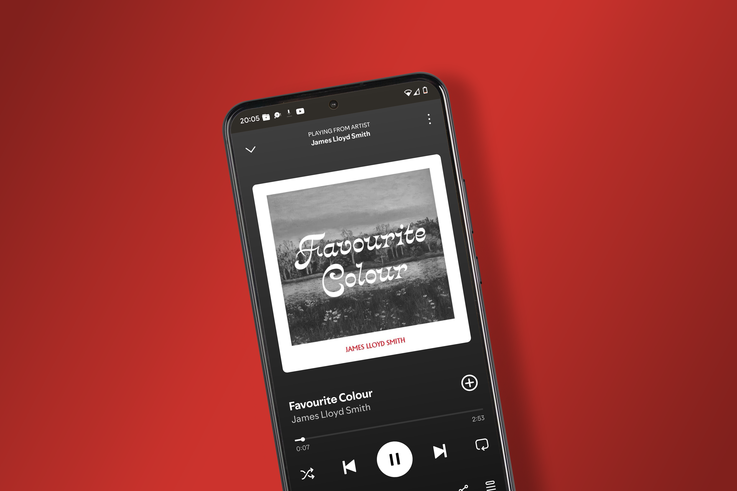
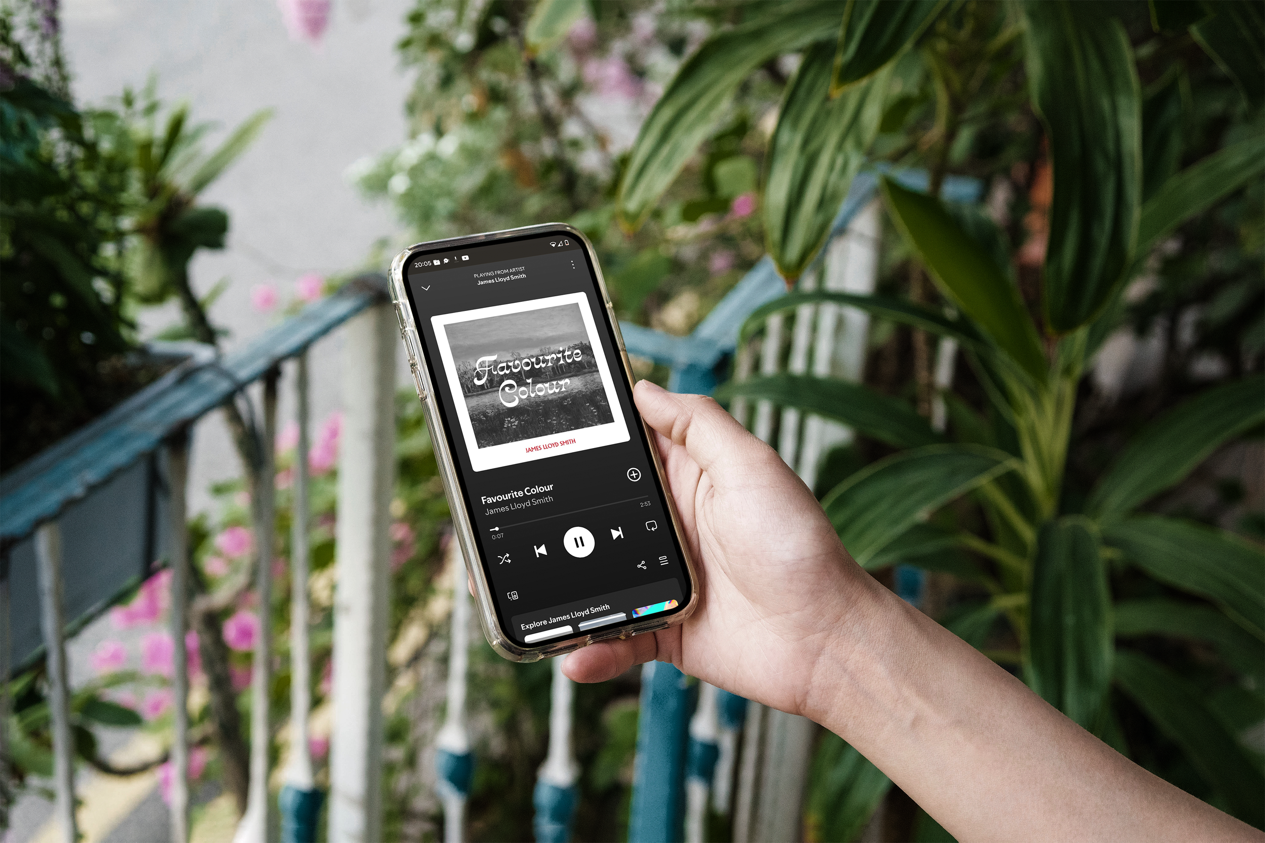
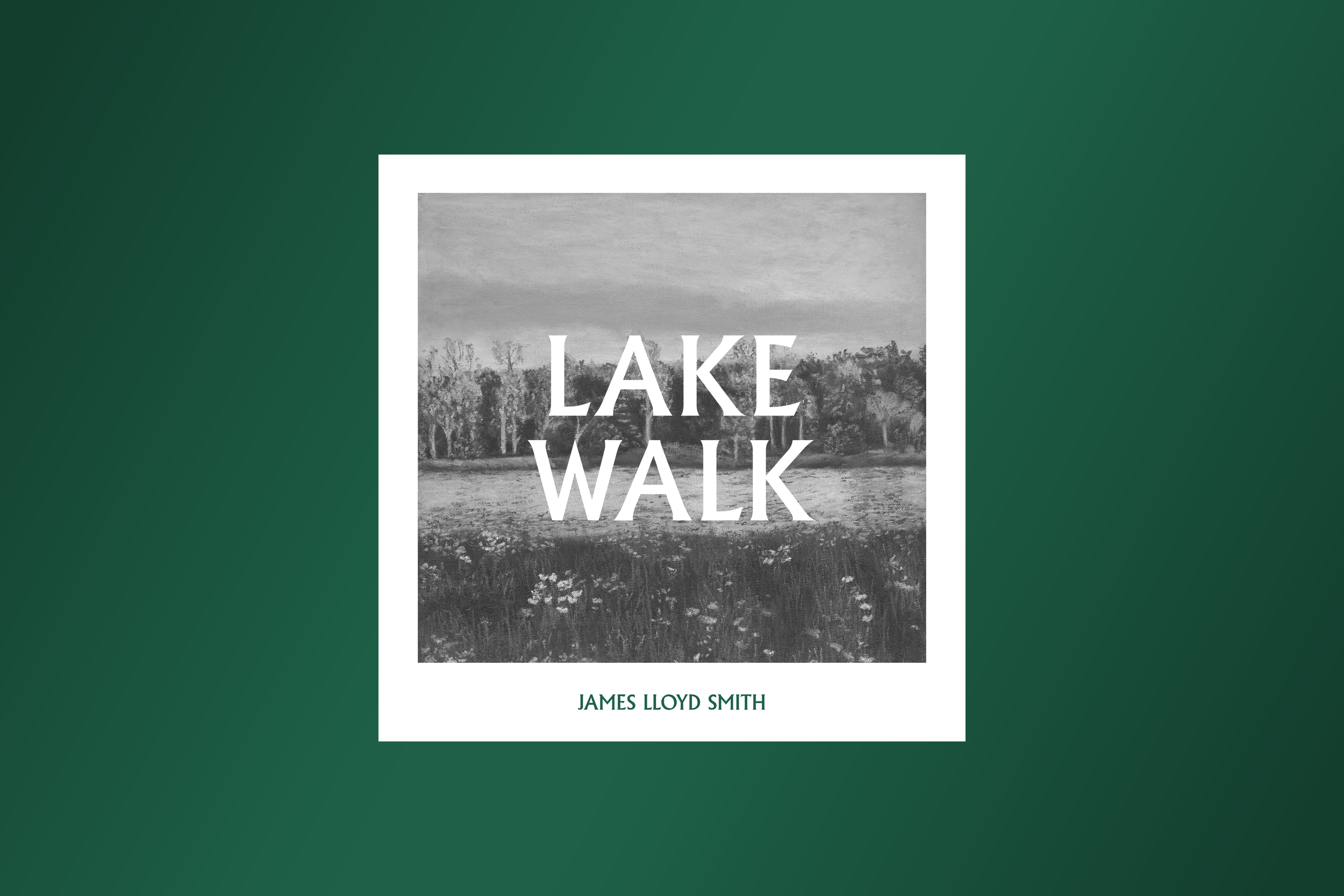
I designed the typographical layout and visual structure for James Lloyd Smith's latest Indie Folk singles. The goal was to integrate a commissioned painting with the artist's Wes Anderson-inspired aesthetic being developed for his "Favourite Colour" music video. My solution involved carefully selecting typefaces and the use of a geometric layout, successfully establishing a cohesive visual identity to elevate his streaming visibility and define the look for future releases.
Client: James Lloyd Smith
Year: 2025


…created a consistent aesthetic and beautiful visual world…
“James transformed my rough concepts and references into beautiful work that created a consistent aesthetic and beautiful visual world for my musical releases.”

James Lloyd Smith,
Songwriter